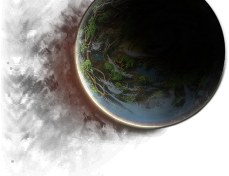
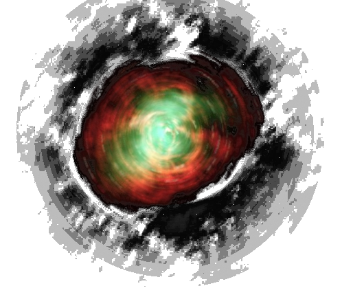
im not sure why the dev team needed to change the icons in the game. and why the idea of an icon was not considered in the redesign.
i am sure that it was a lot of work, done with love. and on there own, each of those illustrations are well done, even though they are much too small to be appreciated.
next to each other they destroy the calm that make up this game. looking at an inventory, much less a guild hall is impossible.
even in the weapon slot it distracts. imagine someone would redesign traffic signs like that.
i was reprimanded in-game for speaking out about it. told to come here, as to not put off newcomers. but newcomers will also be overwhelmed by this.
i can tell you from 20 years experience in interface design, icon design and programming. an icon is there to reduce the need for explanation to not overwhelm, to not distract. it also is not a piece of art to be admired along the way.
there is actually a place for that in-game. the "info" of each item! it still only shows the same image for every single item in the game. that and a title. pointless. if that function would get those illustrations as well as a little more information, it would be great. i could look at it when i want, not when i am forced to.
since this game is also a lot of work to play, i am losing quite a lot now.
and I am not sure why.
so, good bye.
---
Fry, of all the friends I've had, your're the first!

