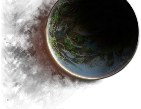
Probably just me but I'd love to see a light background and the logo framed in the typical world/space/etc. Too much dark looks tacky to me. I love the general layout itself though and I hope it's implied that there won't be some awful background trying to fill up any and all whitespace.
Some more navigation or jump links might be helpful too. I'm assuming the info that's currently there will be reworked to optimum.
Really great to see this finally being done though. Much needed for a very long time.
Some more navigation or jump links might be helpful too. I'm assuming the info that's currently there will be reworked to optimum.
Really great to see this finally being done though. Much needed for a very long time.


