#61 Добавлено Ulukyn 5 лет назад Доклад | Цитировать
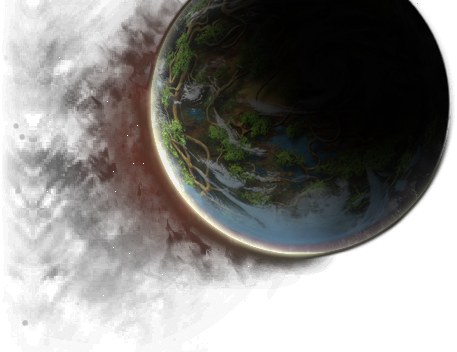
I have made a little change lowering the saturation.
Also added a colored border to help a little in fyros, matis, tryker and zorai background.
Your opinions?
Edited 5 times | Last edited by ERR: Author Not Set (5 лет назад)
#62 Добавлено Aleeskandaro 5 лет назад Доклад | Цитировать
Last edited by Bisugott (5 лет назад)
---
#63 Добавлено Luminatrix 5 лет назад Доклад | Цитировать
#64 Добавлено Yaandor 5 лет назад Доклад | Цитировать
#65 Добавлено Craftjenn 5 лет назад Доклад | Цитировать
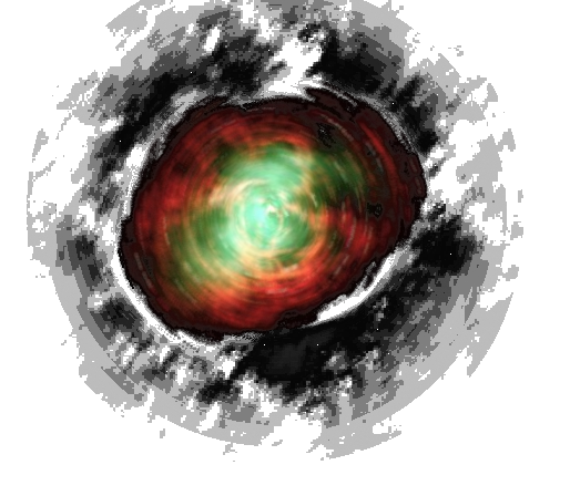
I have made a little change lowering the saturation.Also added a colored border to help a little in fyros, matis, tryker and zorai background.Your opinions?
https://fr.wiki.ryzom.com/wiki/Utilisatrice:Craftjenn
#66 Добавлено Moniq 5 лет назад Доклад | Цитировать
Edited 3 times | Last edited by Moniq (5 лет назад)
#67 Добавлено Jorgensen 5 лет назад Доклад | Цитировать
#68 Добавлено Ekoh 5 лет назад Доклад | Цитировать
Last edited by Ekoh (5 лет назад)
powered by ryzom-api